Rouven Rempfler
Sketchbook
2022


Rouven Rempfler
Sketchbook
2022
Close
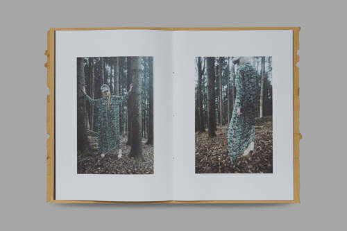
Rouven Rempfler (*1972 in Appenzell, Switzerland) is an artist based out of St.Gallen with a knack for iron plastics and painting. Back in his old workshop, he used to cover large-format wooden panels in acrylic paint; later – having now moved into a small city apartment – he downsized to DIN A4 paper paintings. Over the past years, innumerable drawings, sketches, and collages have come into being. Rouven tells that he doesn’t mentally process his images first, but that they originate directly from the free movement of his wrist. We took a wee selection of his vast oeuvre and created a book of 600 pages showcasing this multifaceted artist.
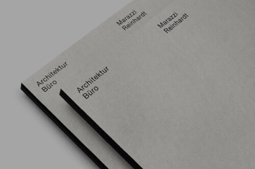
Marazzi Reinhardt Architecture
Identity and Website
2014/2022


Marazzi Reinhardt Architecture
Identity and Website
2014/2022
Close
Client:
Marazzi Reinhardt
Design, Concept:
Bureau Collective
Ollie Schaich
Code:
Felix Niklas
Photography:
Ladina Bischof
Ramon Spaeti
Typeface:
Union
Characteristic of Marazzi Reinhardt’s work is the display of raw materials and the infallible feeling for how to stage traditional details in a contemporary way. Their architecture finds surprising possibilities and potentials way beyond the limits of a given task. We based their visual identity on a simple and clear, yet adjustable grid. Each format is divided in half exactly, defining the position of the copy and images. The typeface is used in two sizes only. A uniform grey scale runs from Marazzi Reinhardt’s print materials to the background of the website and even into the premises of the office space. We made the identity in 2014 and did a soft-relaunch of the website in 2022.
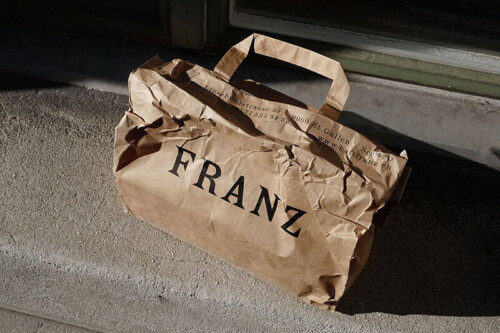
Wyss Drugstore
Identity
2022


Wyss Drugstore
Identity
2022
Close
Noah Freher took over at Drogerie Wyss, a drugstore in Frauenfeld, Switzerland. The naturopathic practioner is trained in traditional European medicine and now runs two businesses: this “herbal house” and his practice. Noah was looking for a website layout everybody from his team could easily manage, so we created a simple and clean look. In irregular intervals, Noah also releases issues of “Wyssblatt”, each featuring an abstract-naïve illustration in black.
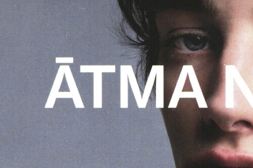
Atma Natural
Identity
2020


Atma Natural
Identity
2020
Close
Client:
Atma Natural
Design, Concept:
Bureau Collective
Photography:
Maarten Schröder
Typeface:
Neue Haas Grotesk
Atma Natural is a lovely hairdresser studio run by Franziska Dörig, based in Biel, Switzerland. Franziska only uses natural products and promises her customers 'slow and natural beauty'. We did a small identity with images from Maarten Schröder (NL). We were impressed by the naturalness and honesty that his pictures express and thought they would be a good fit. The natural aesthetics are also reflected in the choice of materials for printed products.
Textile and Design Alliance
Identity and Website
2019


Textile and Design Alliance
Identity and Website
2019
Close
Client:
TaDA Textile and Design Alliance
Design, Concept:
Bureau Collective
Ollie Schaich
Code:
Bänziger-Hug
Photography:
Ladina Bischof
Typeface:
Kunst Grotesk
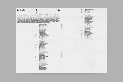
TaDA – Textile and Design Alliance is a cultural promotion programme. Its goal is to promote artistic exchange among the textile- and design culture milieu of Eastern Switzerland and thus strengthen the regional identity. Bringing together culture with practice and the local textile companies is a central and fertile component. TaDA subsidizes one-year work stays in Switzerland for six to eight national and international contributors. The residents develop innovative projects in the fields of art, design, architecture, literature, the performing arts, or in transdisciplinary contexts. As programme partners, textile and design companies in Eastern Switzerland share their know-how and technology with the artists, thus giving them an opportunity to do both practical and artistic work and carry out applied research. At the same time, the industry partners reap inspiration from the creative exchange with the art practitioners invited.
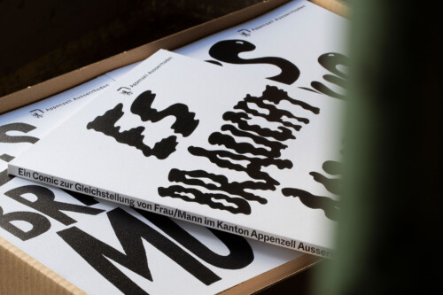
Amt für Kultur
Book
2019


Amt für Kultur
Book
2019
Close
Client:
Fachstelle Gleichstellung Frau/Mann
Canton Appenzell Ausserrhoden
Design, Concept:
Bureau Collective
Ollie Schaich
Illustration:
Dario Forlin
Lika Nüssli
Typeface:
Whyte Inktrap
ISBN:
978-3-85882-832-3
With tongue-in-cheek humor, “Stein” and “Pfütze” take us through the history of gender equality around the world, in Switzerland, and especially in one of its cantons, Appenzell Ausserrhoden. Having arrived in the present, this retrospective, artistically staged by Lika Nüssli and Dario Forlin, attests that society still has a lot of work to do about gender equality. An entertaining anniversary contribution to 20 years of the “office for equal opportunities for women and men” and 30 years of women’s voting rights in the canton of Appenzell Ausserrhoden.
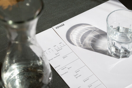
Louis Vuitton
Identity (not realized)
2019


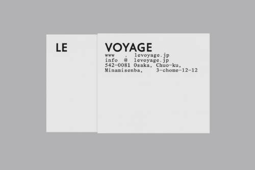


Louis Vuitton
Identity (not realized)
2019
Close
Client:
Louis Vuitton
Design, Concept:
Bureau Collective
Data-Orbit
Ollie Schaich
Animation:
Data-Orbit
Typeface:
Futura
Monument
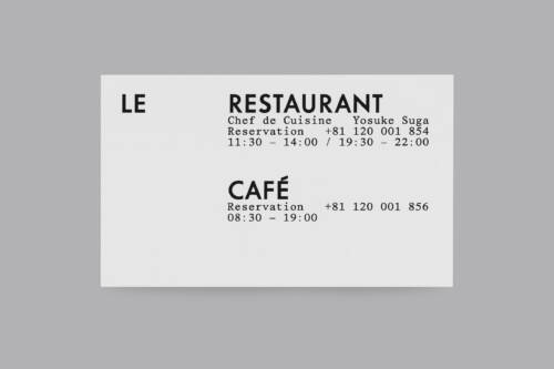
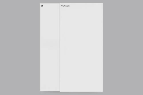
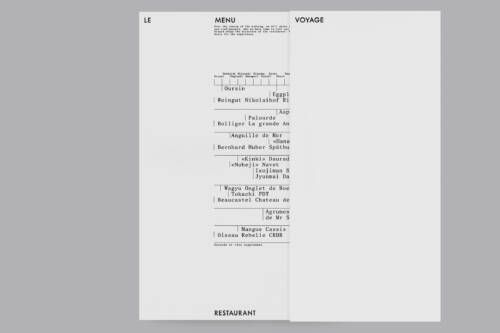
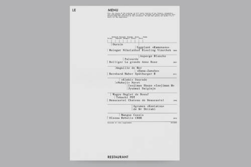
Exploration after being invited to pitch for the worldwide first Louis Vuitton Restaurant Café which opened its doors in Osaka in 2020. We named the new space “Le Voyage” – a multilayered play on the initials and main logo, LV. The three design directions were thought upon the following key topics: DISTANCE: The space in between the “Le” and “Voyage” is based on the Louis Vuitton logotype. This space stands for traveling the journey from Paris to Osaka, including all the stops on the go. MODULARITY: Inspired by the Japanese vertical spelling, we created a system that allows for implementing keywords like Osaka, Café, Restaurant, etc. playfully. TIME: This concept is based on the displacement of the “L” and the “V” of the Louis Vuitton Icon. The shift symbolizes day and night and the changing timezones. The results were the starting point for the general implementation of the new identity which was to be finally realized by the internal design team at Louis Vuitton.
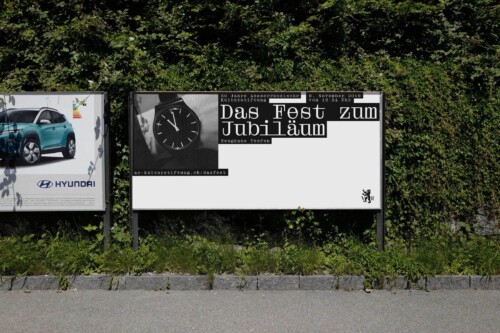
Kulturstiftung AR
Identity
2019


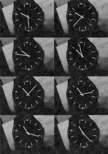


Kulturstiftung AR
Identity
2019
Close
Client:
Kulturstiftung
Appenzell Ausserrhoden
Design, Concept:
Bureau Collective
Ollie Schaich
Animation:
Data-Orbit
Typeface:
Droulers Regular
The visual identity for the 30-year anniversary of the Cultural Foundation Appenzell Ausserrhoden is based on the representation of time (backward and forward). To realize the requested flexibility of the different format applications, we built the concept to be responsive in as many ways as possible. The wristwatch serves as a central element, tying together the different guest contributions at the event itself.
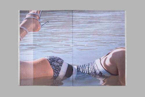
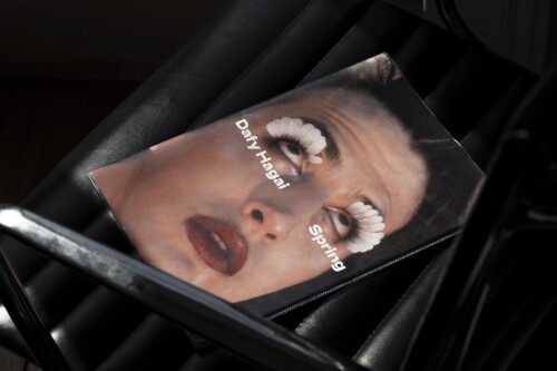
Dafy Hagai
Magazine
2018


Dafy Hagai
Magazine
2018
Close
Client:
Perimeter Editions
Design, Concept:
Bureau Collective
Ollie Schaich
Photography:
Dafy Hagai
Editors:
Justine Ellis
Dan Rule
Typeface:
Adieu
Interview:
Dazed
ISBN:
978-0-6482628-3-1
Dafy Hagai’s Spring sees the young Israeli photographer offer a new layer of complexity and fluidity to the visual languages and queer motifs. Shot amid the marginal urban spaces that punctuate Tel Aviv, Jaffa, Arad, and Furadis – and punctuated with images from the more lush surrounds of Sakhne and the Dead Sea – the series lends a vantage on a gender dynamic that is as hard to define as its socio-geographical context. Here, Dafy Hagai juxtaposes members of Israel’s drag community with public passersby, and gender-ambiguous models to candid, more traditional visions of masculinity. We’re left in a kind of flux – a position that feels refreshingly authentic to our contemporary dynamic.
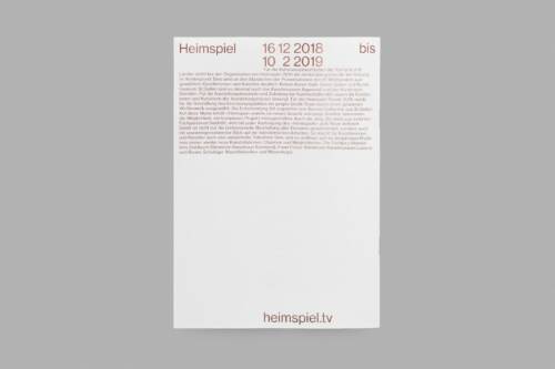
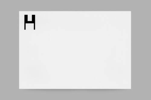
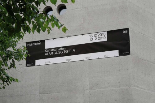
Heimspiel
Identity and Exhibition
2018


Heimspiel
Identity and Exhibition
2018
Close
Client:
Heimspiel (Trägerschaft)
Design, Concept:
Bureau Collective
Ollie Schaich
Animation:
Patrik Bablo
Typeface:
Neue Haas Grotesk
Code:
Jakub Straka
Identity for the triennial exhibition format Heimspiel, a competition for artists from Eastern Switzerland. The starting point for the concept is the initial of Heimspiel. The surfaces of the letter can be fitted to a wide variety of rectangular formats. The white surfaces symbolize projection surfaces for artists from the catchment area of the cantons Appenzell Ausserrhoden and Innerrhoden, Glarus, St.Gallen, and Thurgau as well as from Liechtenstein and Vorarlberg. The “H” becomes a “logo” although it is not really one. It moves into the background and effectively brands the various means of communication.
Hilti Art Foundation
Book (not realized)
2018


Hilti Art Foundation
Book (not realized)
2018
Close
Client:
Hilti Art Foundation
Design, Concept:
Bureau Collective
Ollie Schaich
Typeface:
Helvetica Neue
Didot Elder
There is a private art collection the Hilti Art Foundations owns which comprises well over 200 paintings, sculptures, and photgraphies from the era of classical modernism up to contemporary styles. We were invited to pitch our ideas for an archive book in which each piece would be staged in a double-page layout. To not become repetitive over the course of 400 pages, we introduced a grid system that strictly allocated each exhibit to one particular expressive style but did so playfully.
Mono Ring
Identity
2018


Mono Ring
Identity
2018
Close
Client:
Mono Germany
Design, Concept:
Bureau Collective
Ollie Schaich
Photography:
Haw-lin Services
Fabian Frinzel
Code:
Felix Niklas
Typefaces:
Futura Mono
Lausanne
Welcome back, Mono Ring. The cutlery experiment Mono Ring, designed by Peter Raacke, goes back to 1962 and became a classic after being on the market for three decades. Far more than 1,000,000 units of this unique flatware were sold worldwide. Peter Raacke’s idea remains strong: flatware that does not need a drawer and does not have to be placed next to the plate. Instead, it hangs visibly and handy from a cross-shaped rack in the center of the table, and diners around the table help themselves. This design quality is as important and persuasive today as it was back in the 60ies. In 2018, a new chapter in flatware history began for Mono Ring when Mark Braun revised its shape and and refreshed its color palettes. In close cooperation with Mono, we defined exciting, yet subtle new design elements and guidelines, which were then introduced into the entire identity of the cutlery manufacturer in Mettmann, Germany, after the re-release of Mono Ring.
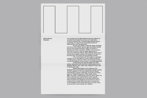
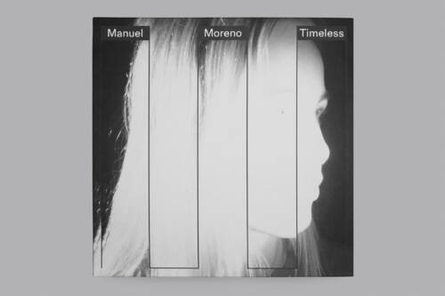
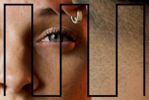
Manuel Moreno
Identity and Website
2017


Manuel Moreno
Identity and Website
2017
Close
Artist:
Manuel Moreno
Design, Concept:
Bureau Collective
Ollie Schaich
Code:
Felix Niklas
Video Sequence:
Sebastian Vargas
Animation:
Data-Orbit
Photography:
Jacques-Aurélien Brun
Tobias Siebrecht
Typeface:
Basis
Manuel Moreno is a music producer and DJ from St.Gallen, Switzerland. For almost two decades, he has been taking his audience on a journey inspired by his long-standing relationship with music. Our visual concept is based on his initials. The abstracted “MM” locks in perfectly with the linear oscillations of electronic beats. To bring the grid to life, we combined it with many different elements like pictures, videos, colors and animations. Against this organic background there are no limits to the placement of typography.
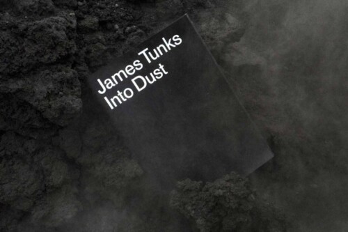
James Tunks
Magazine
2017


James Tunks
Magazine
2017
Close
Client:
Perimeter Editions
Design, Concept:
Bureau Collective
Ollie Schaich
Photography:
James Tunks
Editor:
Dan Rule
Typeface:
AG Old Face Regular
ISBN:
978-0-9953586-2-1
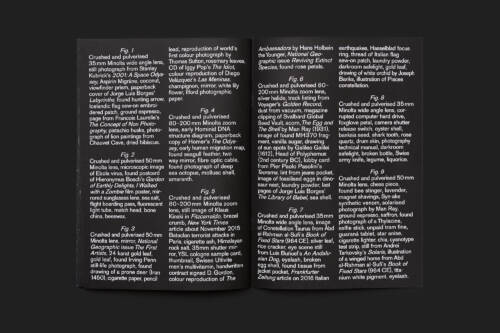
Photography represents a mode of conceptual, material, and historical inquiry for Melbourne-born, Frankfurt-based artist James Tunks. An expansion from his 2017 solo exhibition “Elsewhere” at the Center for Contemporary Photography (Melbourne), his debut book “Into Dust” sees Tunks construct fake astronomical photographs using found and accumulated materials – crushed and pulverized to mimic interstellar nebular. While these sweeping vistas are immersive and engulfing in their aesthetic scope, their associated lists of materials come to form fascinating abstract texts which echo the history of astrophotography and its pioneers (Edwin Hubble and EE Barnard among them) as adroitly as they tease out evidence of Tunks’ day-to-day. As such, “Into Dust” forges an ode to the genre and sketches an indirect self-portrait in the same breath. 44 pages, A4, saddle stitched, screen-printed linen softcover. Edition of 300.
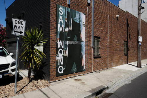
Sam Wong
Exhibition
2017


Sam Wong
Exhibition
2017
Close
Client/Photography:
Sam Wong
Design, Concept:
Bureau Collective
Ollie Schaich
Published by:
Diane Incorporated
Typeface:
Proto Grotesk
Sam Wong is a Melbourne photographer, specializing in editorial and art based practice. With “Quarter Past One”, he captured a whole bunch of awesome images from his photographic trigger finger. One year in the making, surveying a busy street corner of Melbourne’s CBD. With the book published by Diane Inc., and with an exhibition supported by the City of Melbourne, this project hones in on a particular mirror, exposing the action, excitement and mundanity that occurs every day at approximately a quarter past one (13:15).
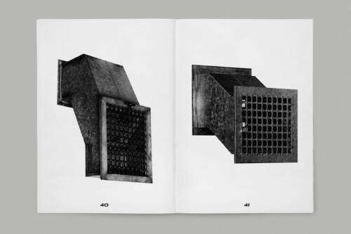
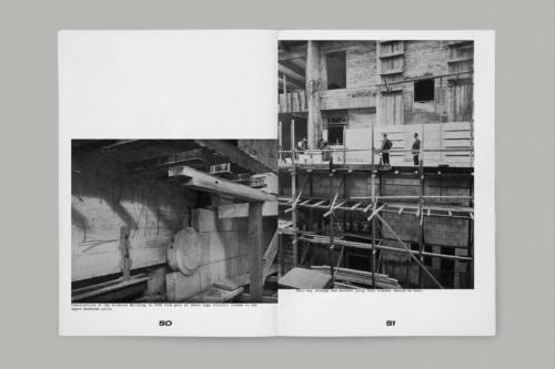
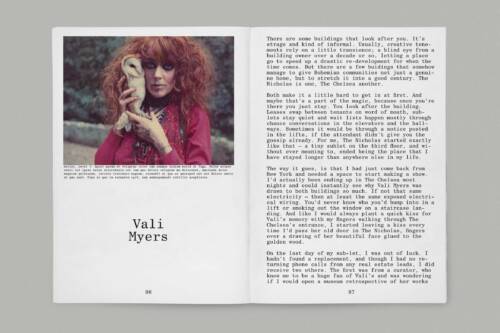
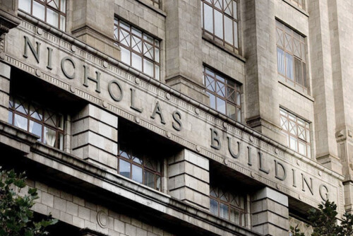
Nicholas Building
Book (not realized)
2017


Nicholas Building
Book (not realized)
2017
Close
Client:
Folk Architects
Design, Concept:
Bureau Collective
Ollie Schaich
Content, Research:
Christie Petsinis
Tim Wilson
Typeface:
Century Schoolbook
Druk Wide
Research project about the Nicholas Building meant to materialize as a book. Nicholas Building is one of the most impressive buildings in the heart of Melbourne. The building was commissioned by the philanthropic Nicholas family, who made Aspro (Aspirin in Australia) famous. The construction was completed by architect Harry Norris in 1926. The family’s idea was to create a hub for artists in a central location. The concept is still maintained today, and much of the building is still in its original state. The studios are used by a wide variety of disciplines in the creative field. Accordingly, a number of exciting stories and traces wait to be found. Before undergoing modernization in 2012, the Nicholas Building was home to the last manually operated elevator in Melbourne.
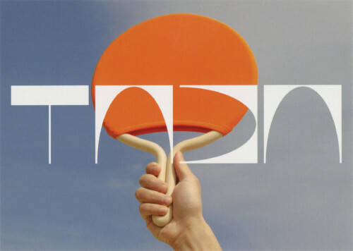
Studio Siebrecht Photography
Website
2016


Studio Siebrecht Photography
Website
2016
Close
Client:
Tobias Siebrecht
Design, Concept:
Bureau Collective
Ollie Schaich
Code:
Bänziger-Hug
Typeface:
Résidence Regular
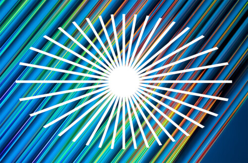
Tobias Siebrecht is a Zurich-based photographer working on still life and product photography. His practice balances commercial with artistic projects, always finding room for an experimental and contemporary approach to photography tailored to the specific needs of his clients across the fields of design, technology, fashion, music and advertising. His modernist, colourful, and minimalistic images illuminate the technological evolutions in modern society. We started his website back in 2012 and undertook a gentle redesign a few years ago. The sun graphic was originally designed by Kasper-Florio for Tobi's electronic music label “Mitsutek”.
Soirée Graphique
Poster
2016


Soirée Graphique
Poster
2016
Close
Client:
Soirée Graphique
KOMET
Design, Concept:
Bureau Collective
Ollie Schaich
Photography:
Helen Korpak
Typeface:
Inhouse Gothic
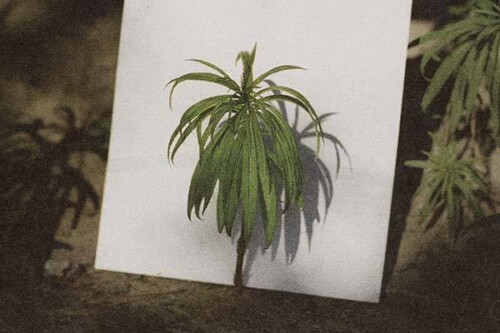
Our dear A4 came all the way from the universe. She became friends with the little palm tree and is now chilling in the sun. Contribution to the Soirée Graphique Issue 9 NORDEN. Since 2008, Soirée Graphique has been promoting dialogue between artists from different creative disciplines. In 2016, 59 photographers and graphic designers from Denmark, Sweden, Norway, Iceland, Finland and Switzerland came together for an artistic exchange.
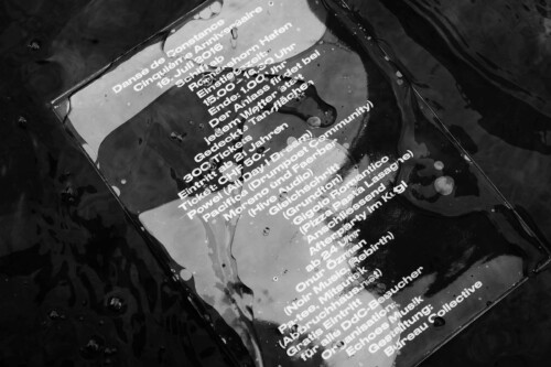
Danse de Constance
Identity
2016


Danse de Constance
Identity
2016
Close
Client:
Echoes Music
Design, Concept:
Bureau Collective
Ollie Schaich
Animation:
Data-Orbit
Typeface:
Druk Wide
Danse de Constance is a small electronic music festival, which takes place once every summer on the Lake of Constance in Switzerland. 350 good-spirited people fit on board of the boat. For the 5-year anniversary coupons, tickets, bags, postcards and posters were printed on a transparent medium. Mixing waves of water with those of music was the starting point for the typographic solution. If light penetrates the defined elements, new and unexpected moods arise.
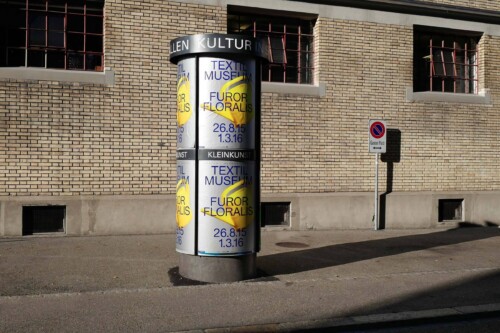
Textilmuseum
Poster/Exhibition
2015


Textilmuseum
Poster/Exhibition
2015
Close
Furor Floralis – flower mania! Whether a flamboyant sea of flowers, a wild mass of tendrils or tenderly scattered blossoms, whether arranged as decorative posies or as stylised geometric ornaments: floral motifs have inspired textile designs from the Middle Ages to the present. With its garden of glorious flowerpatterned textiles, the “Furor Floralis” exhibition reveals the intriguing parallels between textile design and horticulture. An exhibition at renowned Textilmuseum St.Gallen on the confluence of flowers and gardening in the textile industry. The watering can links flower and garden with a positive connotation of growth, expansion, and development. 5-color offset print with a Pantone Silver background and animated in the digital implementation.
Bollhalder Eberle Architecture
Identity and Website
2015


Bollhalder Eberle Architecture
Identity and Website
2015
Close
Client:
Bollhalder Eberle Architecture
Design, Concept:
Bureau Collective
Ollie Schaich
Code:
Bänziger-Hug
Photography:
Ladina Bischof
Typeface:
Favorit Regular
GT Sectra Book
The work of Bollhalder Eberle is characterised by an intensive preoccupation with architecture of different scales and typologies. A love for detail and an enthusiasm for architecture are always at the centre of every project. The appearance for Bollhalder Eberle is based on a strict, but also dynamic grid. The vertical lines vary depending on the format and define the column width. The grid lines continue as a subtle element in printed applications. In this case, a special bleach technique was used to imitate a watermark in offset printing.
Kafi Franz
Identity
2014


Kafi Franz
Identity
2014
Close
Kafi Franz is a wonderful cozy place with excellent and fresh prepared homemade cakes, quiches and dishes, a few streets away from the St.Gallen city center. We created an identity based on the Etienne typeface that we found in an old manuscript book. The restaurant has a quiet and pretty back garden and there is an especially good brunch every Sunday. Make your reservation here.
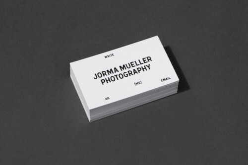
Jorma Mueller Photography
Identity
2012


Jorma Mueller Photography
Identity
2012
Close
A quaint corporate identity and simple website we did in 2012 for the photographer Jorma Mueller from Zurich. All is quite minimalistic, much like himself. Business cards are printed on a bulky paper, just black and white. Please note that Jorma is meanwhile operating at a new address (Zimmerlistrasse 6, 8004 Zurich). Luckily his mobile number has survived over the years.
Danse de Constance
Identity
2012


Danse de Constance
Identity
2012
Close
Danse de Constance is a small electronic music festival, which takes place annually on the Lake of Constance in Switzerland. 350 like-minded people fit on board of the boat. In 2012, we created the the name and the communication of the event. The day rave was presented by the label Echoes Music from St.Gallen.
Stefanie Biggel
Lookbook
2012


Stefanie Biggel
Lookbook
2012
Close
Client:
Stefanie Biggel
Design, Concept:
Bureau Collective
Ollie Schaich
Photography:
Maurice Haas
Model:
Helena
Hair and Make-Up:
Linda Sigg
Lena Fleischer
Styling:
Oriana Tundo
Typeface:
Founders Grotesk
Stefanie Biggel is a fashion designer from Zurich. The Fall/Winter 2012 issue “You won't need me where I'm going” is one of four lookbooks we designed for her. The content is stapled into a folded envelope. The cover offers both protection and acts as an additional space for other printed products, like postcards, business cards, etc. The lookbook was produced in an edition of only 500 copies. We owe the great pictures to Maurice Haas.
Theater St.Gallen
Posterseries
2011/12


Theater St.Gallen
Posterseries
2011/12
Close
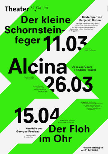
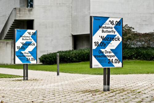
The posters are subject to a strict grid which can be adjusted if needed. Through the selective use of color, the typographic effect is reinforced and promoted. Based on the monthly poster concept, newspaper ads, posters, programme leaflets, etc. can be quickly designed while never compromising their aesthetic appeal. The posters are produced using a two-color silk-screen printing method. The use of special inks, varnishes, etc. creates more freedom to nurture this independent style.
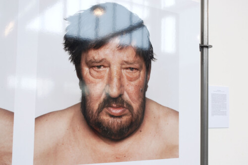
Variety of Facial Expressions
Art
2008


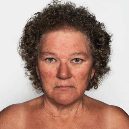


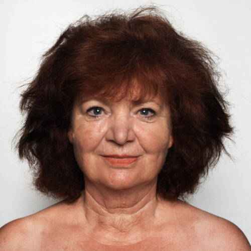


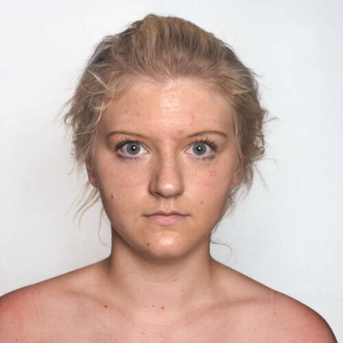


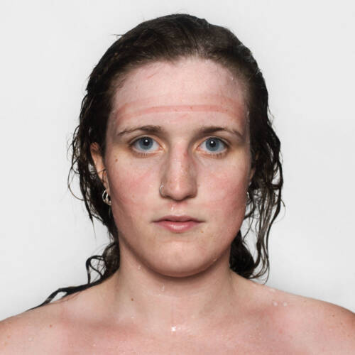

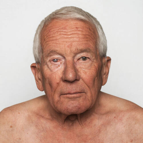


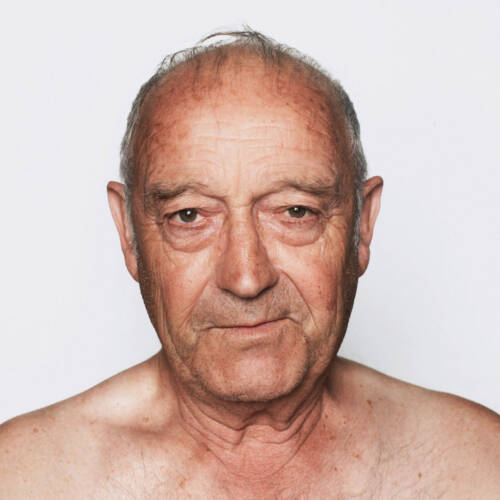


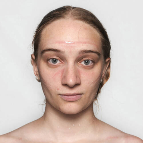


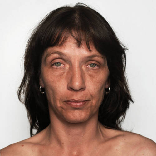


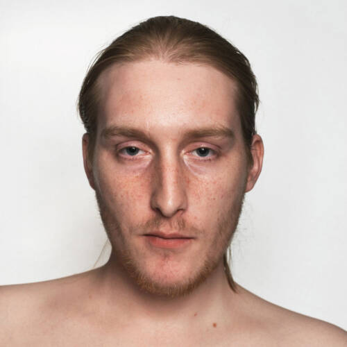
Variety of Facial Expressions
Art
2008
Close
FHNW Academy of Art and Design
The Basel School of Design
Bachelor of Arts
This project visualizes the rich diversity of the human face. It shows that uncontrollable and non-verbal signals may change radically within a very short period of time. For this purpose, 250 probands were photographed in identical settings but before and after a particular action which leaves a non-manipulable imprint on the facial expression. Parameters like stress, joy, concentration, exhaustion, etc. are reflected individually in the person’s neutral glance and thus subtly alter their physiognomy. The main goal of the project is to reveal the subtile changes of the human face – nuances that broach the issue of a short-time interplay of inner life and outer expression of a human being.